Lambda DS31 - Unit 1 - Project 1: Does renewable energy availability relate to a happiness score?
My first data science project. The analysis described below was done using Python language and Google Colab. The Colab coding file can be found here. Your comments on my code can be sent to janelleamills@gmail.com.
I. How does renewable energy relate to happiness?
Renewable energy is energy which is derived by harnessing the natural resources such as wind, solar, hydro, and geothermal. These sources are naturally replenished.
In the last 10 years, consumers and governments around the world have been pushing the energy and technology sectors to utilize renewable energy generation wherever possible. These efforts are validated by the signing of the 2015 Paris Agreement and the development of the United Nations Sustainable Development Goals. The remaining question is how the people who requested these changes perceive them when they are implemented, and if this contributes to the happiness?
The World Happiness Report (WHR), generated by the UN and contributing universities annually since 2012, strives to provide a holistic view of happiness in a country. Currently, the most focused areas of concern in this analysis include: (a) GDP per capita, (b) social support, (c) healthy life expectancy, (d) freedom to make life choices, (e) generosity, and (f) perceptions of corruption. There is, however, a final category that is seldom discussed: Dystopia and residual.
 From WHR 2021. Copyright Sustainable Development Solutions Network.
On one hand, the Dystopia portion of this final category includes a correction to the data, by setting the country with the lowest score as the correction factor in the analysis. On the other hand, the residual portion is a value that the researchers found in their analysis that is not explained by any of the other factors mentioned above. To clarify: the researchers selected the first six categories because the data collection methods were more standardized amongst nations and readily available.
Given that the WHR report makes clear that other focus are may be added to the analysis, I became curious if renewable energy may be part of the residual that has yet to be quantified. The information presented below describes my data selection methods and findings in this analysis.
II. Description of the data
(1) After searching for relevant datasets, I discovered the challenge of finding data about power plants around the world. The most robust database I could find is compiled by World Resources Institute (WRI) based in Washington, DC. The dataset lists more than 35,000 power production plants including, the plants’ power capacity, fuel types (primary, secondary, and tertiary), estimates for power production (2014-2019), and actual power production (2014-2019).
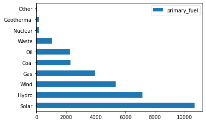
Number of power plants grouped by primary type in WRI sheets.
In exploring the data and performing a .value_counts(), I discovered that the total number of renewable power plants (wind, hydro, solar) far outnumbered the quantity of non-renewable power plants.
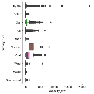
When I compared the energy capacity by fuel type, I discovered that the average nuclear (non-renewable) plant had the capacity to produce more energy than any other type. Coal and gas fueled plants were second and third, respectively. Of most note was that Hydro fuel plants had the most outliers of the dataset. While the average hydro capacity was on par with solar and wind, there are several hydro power plants with greater capacity to produce power than any nuclear plant. The WRI dataset had limitations. Much of the data about energy production, rather than capacity, was missing for more than 80% of the dataset. To look at energy production, I examined the estimated energy production for 2017 because the least amount of data was missing.
This dataset was cleaned and entries with missing capacities or missing fuel types were removed from the dataset.
(2) From the WHR, I used the dataset from Kaggle which listed the happiness scores and GDP per capita from 2017. This data set had been pre-cleaned by the Sustainable Development Solutions Network, the group that assembles the happiness report. This data provides the index used in the 2017 for the happiness score but does not include raw data or the equations used to derive the score.
(3) Finally, I insert a column from the World Bank, which listed populations by country.
III. Statistical methods
- Hypothesis
- Null hypothesis: The linear regression of happiness score (y) and the percentage of power produced from renewable resources would be 0.
- Alternative hypothesis: The linear regression of happiness score (y) and the percentage of power produced from renewable resources would not be 0.
-
Data wrangling and feature engineering First, I had the calculate the percentage of power from each country that was generated by each type of fuel. This involved writing Python code that calculated the sum of power by energy type and appended that value to a series before appending the total series to the whole DataFrame. Then I found the sums of renewable energy and divided by the total amount of energy for that country to find the renewable/sustainable fuel percentage, a value which resides in the sus_fuel_percent column of the final dataset energy_happy_pop. I also calculated the total generation capacity and total estimated generation. From there, I performed a left .merge() with the happiness score data. Finally, I performed a second left .merge() with the population data.
- Analysis method To begin looking at the data, I used a .pairplot() to compare all of the DataFrame features. Observation of this scatterplots yield that while GDP and happiness scores show a correlation, correlations shown between all other parinings is less clear. I also noted that two outliers made this visualization difficult to parce. The outliers are India and China. To be able to see relationships more clearly, these two countries were removed for the ongoing analysis.

These visualization show that features without India and China. When we observe the happiness_score vs. sus_fuel_percent score, we see a weak linear relationship with data points clustered at 0% sus_fuel_percent and 100% sus_fuel_percent with a negative slope.

IV. Results
I chose to zoom in: happiness_score vs. sus_fuel_percent.
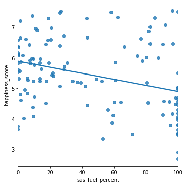
When a line is added to the happiness_score vs. sus_fuel_percent curve, one can see the clusters show that a negative relationship between the the two features. In other words, countries with a lower percentage of renewable energy as a fuel source, show higher happiness scores than countries with a high percentage of renewable energy. To better understand this relationship, I performed an ordinary least squared regression:

In this given dataset, we see that the slope of this linear fit is indeed negative, but the R-squared value indicates that that correlation is weak. When the p-value is examined, we find that its value is zero, which is less that the typical 0.05 that is accepted. This means that we must reject the null hypothesis in this case, and accept the alternative hypothesis.
V. Conclusion
The information yielded from the 2017 data shows a negative correlation between percentage of renewable and happiness score. Does this mean one is the cause for the other? No. Another factor could be at play here. Renewable energy is more expensive than non-renewable. Developed countries, when giving aid to less developed countries often stipulate that only renewables will be supported. It is also possible that the even in majority renewable energy countries that the average citizen may not benefit from power production. We can’t know for certain because so much data is missing.
Furthermore, I would want to perform this analysis of several years to track how this slope changes as sustainability and renewable energy programs are implemented. One year’s data is not sufficient to determine a relationship.
Questions that arise during this analysis:
- Should energy and sustainability practices be included in the World Happiness Report as a category?
- How can countries be aided in collecting and sharing their power generation data to make this analysis more robust?
- Are all power generation plants adequately accounted for in the World Resources Institute data? If not, why?
Rather than answering the question about the relationship between renewable energy and happiness, I think this data analysis yields a baseline for further inquiry and analysis.
The 2021 World Happiness Report can be found here.